I tend to like tapestries that use text in some way. I mostly blame this on
Sarah Swett and her slow literature tapestries because I was in love with them immediately--and I've only seen photos on her website. There were quite a few pieces in the
American Tapestry Alliance's ATB9 at the
Fort Wayne Museum of Art which used text or the idea of text in the work. So here I go with another set of photos from that show...
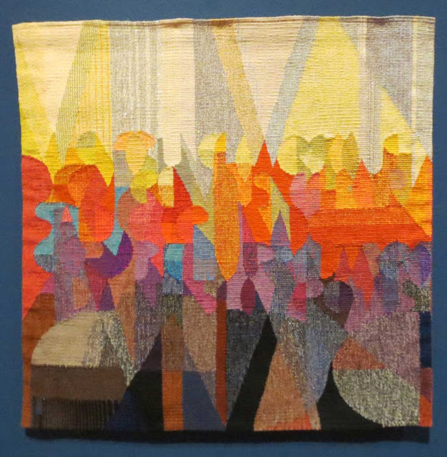
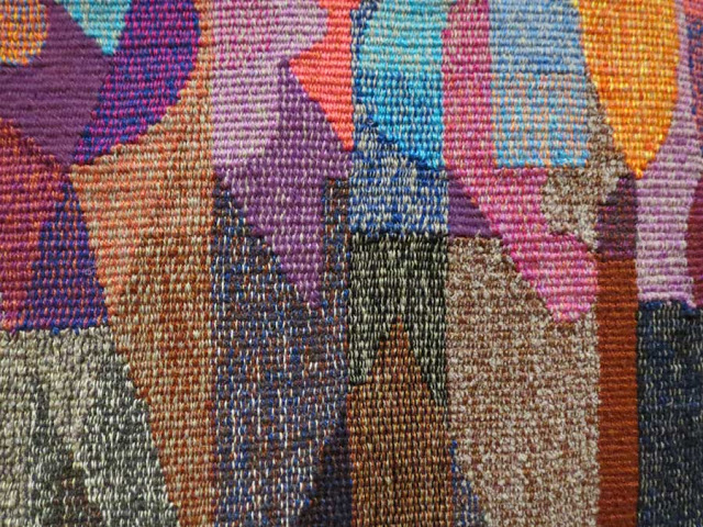
I look a lot at how people blend color in weft bundles. This piece by
Lindsey Marshall has multiple colors in every weft bundle throughout the
piece. You can see this in the detail below quite well. I love the
abstracted typographic forms she uses.
 |
| When Fortune Flowers--Lindsey Marshall; 22.5 x 22.5 cotton, linen, metallic, acrylic |
 |
| When Fortune Flowers, detail |
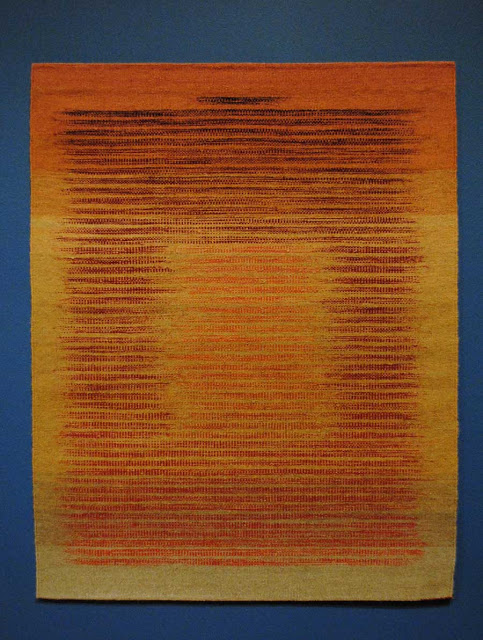
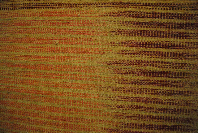
Tara by
Michael Rohde is one of my favorite pieces from the catalog. It did not
disappoint me in person. The surface is alive and so rich. I think this
likely has something to do with the natural dyes as well as a rougher
wool than I use. The use of pick and pick to make the text-like figures
is enchanting. I love how the colors grade throughout the piece.
 |
| Tara, Michael F. Rohde; 45 x 36.5 inches, wool, natural dyes |
 |
| Tara, detail |
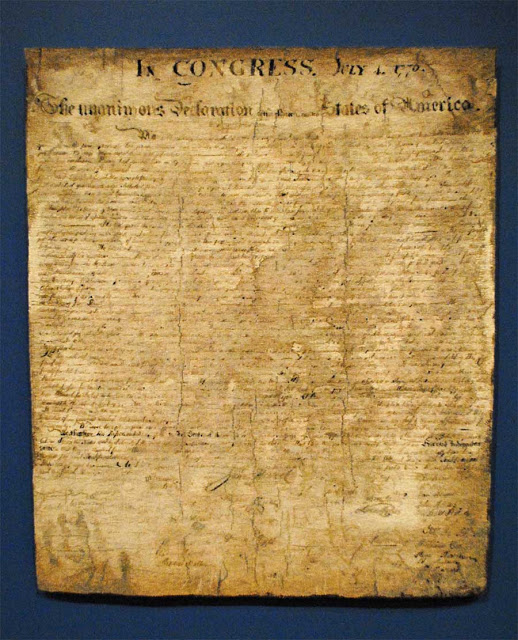
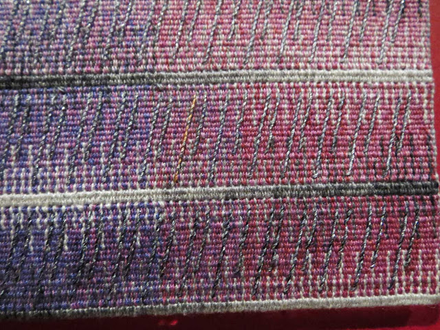
Here is another text piece with both implied and actual text in it.
Marzena Ziejka's
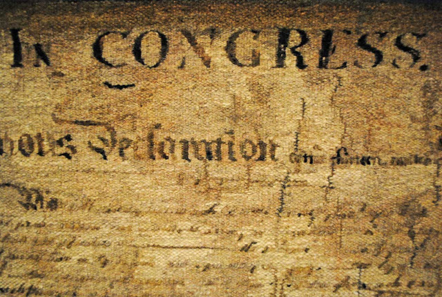
Declaration of Independence is wonderful. Look carefully at the details. The text at the top
("Congress" in the detail) is woven right in and readable as such. The
text farther down is mostly just suggested. But when you stand back and
look at the whole piece, you are convinced that there is text
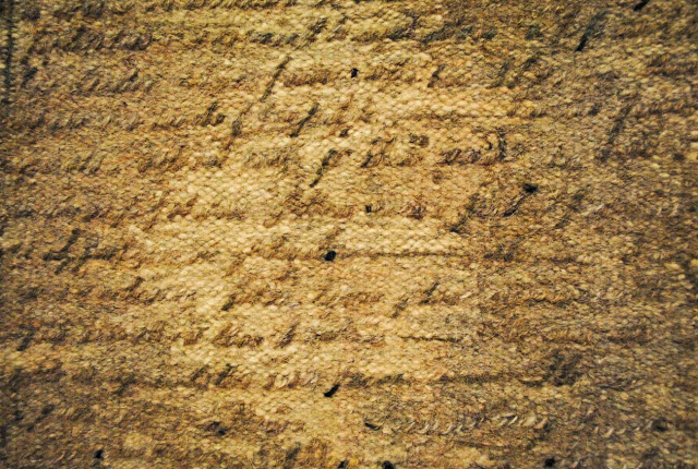
throughout. Look at the second detail. It is done with soumack that is
slanted consistently to look like cursive writing. The
whole piece looks like a piece of parchment with color changes, cracks
made by sewing with darker thread, and uneven-looking edges (they are
actually very straight) done with darker edges in part, a difficult
weaving trick!
 |
| Declaration of Independence, Marzena Ziejka; 50 x 43 inches, hand-spun, hand-dyed wool, linen |
 |
| Declaration of Independence, detail |
 |
| Declaration of Independence, detail |
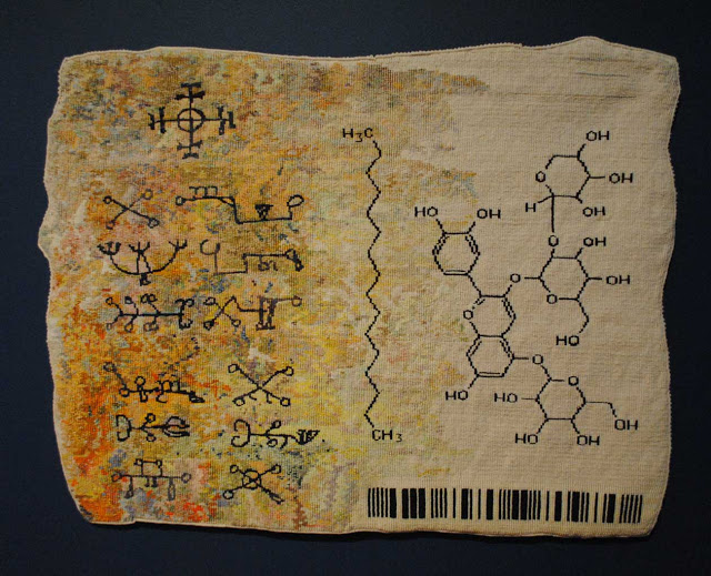
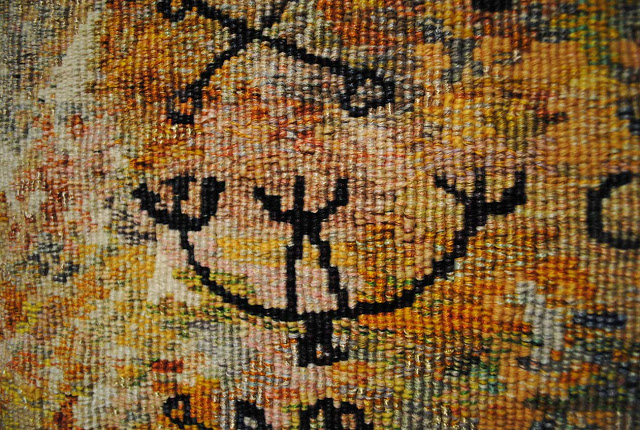
Anne Jackson's piece is also wonderful. Her color use bears some study and you can see some of it in the detail below. The symbols are beautifully done and, according to the catalog, are a mix of magical signs and diagrams from biochemical research.
 |
| The Witchcraft Series: Alchemists, Anne Jackson; 28 x 37 inches, cotton, linen, synthetics |
 |
| The Witchcraft Series: Alchemists, detail |
Anne Jackson's piece reminds me of a postcard.
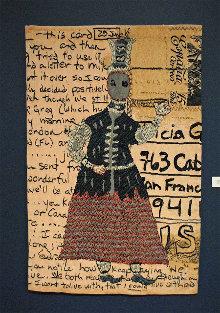
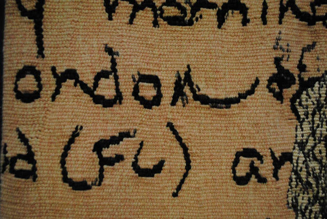
Tricia Goldberg's piece actually was inspired by a postcard.
 |
| Postcard for Angela, Tricia Goldberg; 60 x 39 x 1 inch, cotton, wool, silk |
 |
| Postcard for Angela, detail |
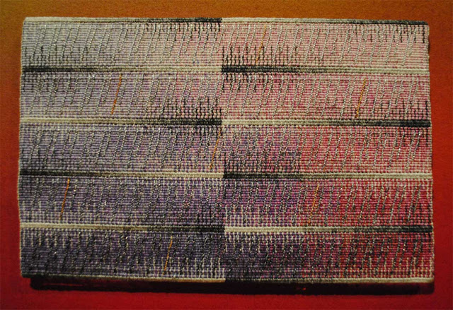
The last piece of this text-related group of tapestries I wanted to show you is
Etude 3 by
Joyce Hayes. I love the beautiful lines in these pieces Joyce does. The changes in value in the colors as well as the beautiful slanting lines do make me hear music. This piece is very small and the intimate viewing distance required adds to the enchantment.
 |
| Etude 3, Joyce Hayes; 8.5 x 9.5 inches, linen, cotton, poly sheen soumak |
 |
| Etude 3, detail |
These text pieces are interesting to me for many reasons. I think I like the regularity that text can create. I love the association with my favorite pastime, reading. I think about my father's type cases full of old type and his printing press running on a Saturday morning, the odor of printers ink filling the air of his shop. And I think about all the books I have yet to read in my life and what that really means to me. Text is beautiful. Especially when woven.
