
Color is amazing, isn't it? It has the ability to delight us and then, just when we think we know how to use it, kick us in the butt. I think I will be learning a lot about color for the rest of my life. (Fortunately!)
As I was answering questions for my online classes this morning, I came across two submissions of the same exercise in the Color Gradation Techniques class. This exercise is part of the transparency section of the class where we practice using this simple technique to create forms that appear to overlap. The technique works best on large-format pieces and with careful choice of value... and saturation!
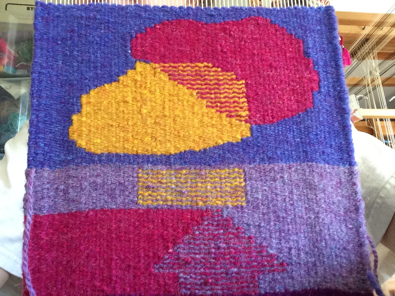
Here are the two examples:

Monia's regular hatching example
Anna's regular hatching example
Looking at the top "overlapping blobs" example in both weavings, I was struck by the different results with fairly similar overlapping colors. Both weavers used a yellow and a red, but Monia's yellow blob has a much greater tendency to come forward than Anna's. I thought at first it was that the intensity of the yellow on the left is greater than on the right. But I think maybe it has more to do with the fact that Anna's pink is also very saturated whereas Monia used a much less saturated color next to the yellow. When the object on top is a lighter value and a higher saturation, our eyes read it as being in front. When the saturations and/or values of the two forms are similar, it is harder for us to believe the two objects are overlapping. And of course other factors like warp sett and the reflectance of the yarn also play a part.
Warp sett can be related to the overall size and how we perceive a piece. Smaller setts (higher numbers) mean that the elements in the weaving are smaller. As a viewer, we tend to come close to study things that are tiny, and when tapestries are woven at smaller setts (12 epi and higher), they tend to be smaller pieces just because of the increased work for a given area. I believe these two examples are both woven at 8 epi, but imagine if one of them was woven half size, at 16 epi? The hatching lines would be much thinner and the blending between the shapes would certainly look less striped at a moderate distance. This would affect whether our brain translated these shapes as "overlapping blobs", or just plain old regular blobs.
Another factor that has fascinated me as I've been working with spinning luster long-wool fleece into tapestry yarn is reflectance. The two yarns in these examples are different. Monia is using a yarn that creates a flatter surface that is not very reflective in this photograph. Anna's yarn is, I am fairly sure, Harrisville Highland, and in this photo, it appears to be more reflective. Of course we'd have to compare the weavings in person to really give this a fair shake--photography can drastically change the look of a fabric.
After this exercise, students in the course work on creating transparency with weft bundling. I can't wait to see what these weavers do with that one!*
What is your experience with saturation of color in tapestry weaving? Leave a comment below!
* If you're one of my Color Gradation Techniques online students, make sure to check the discussion sections on each page of the course. I often add comments like this post right in the course (a version of this, for example is on the submit step for regular hatching and transparency).