Value. I suppose we most often think of that word as referring to what something is worth. But in my world of yarn and dye pots, it mostly means how light or dark a color is.
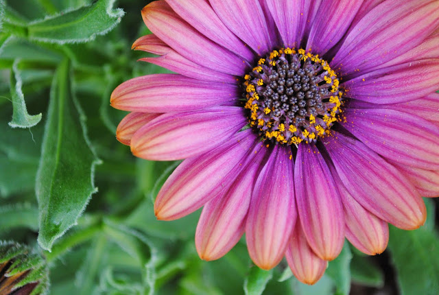
We talked a lot about value in the Color Gradation Techniques class I taught last week in Golden, Colorado. This flower was on the porch of the shop and one of the students pointed out what a lovely color gradation it represented. I am pretty sure I couldn't create this with the colors on my shelf, but I think dyeing them might be an upcoming challenge.
I enjoy teaching classes more and more. Either that or this group of people was just extra special. Or maybe every group is extra special. I'm not sure. We had a small class and they were really interested in exploring color gradation ideas and creating effects with the techniques. (Ha! That is probably why I enjoyed it so much--they were listening!)
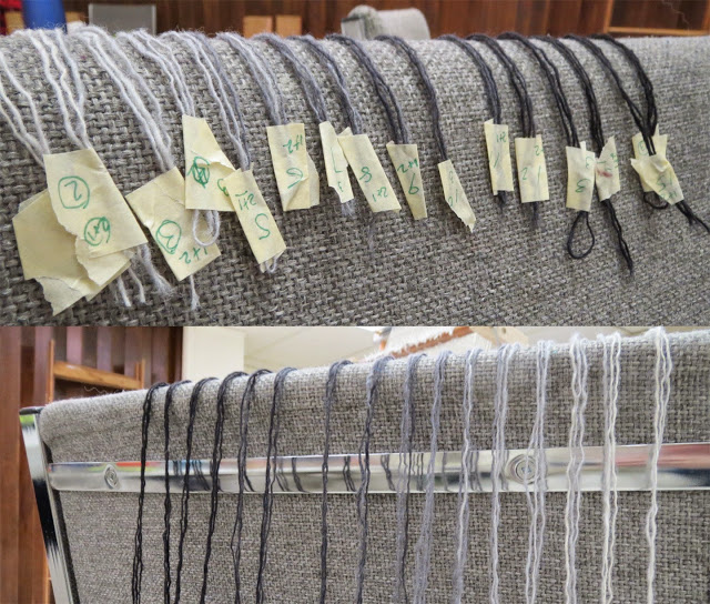
When I start seeing things like the photos below, I know we're in for a good time (or that Judy is ascrazy organized as I am when it comes to color. It is all about the masking tape.)
Here are a few more photos from the workshop.
And here is a photo of a transparency that Judy did. Her idea came from Josef Albers' book, Interaction of Color. She added a purple to blue gradation on the edges. The bars in the center get lighter, but the red and the edges of the gray bars don't change even though they appear to. Also note the double color gradation in the Greek Key design: greyscale while the background is moving blue to purple.
It is mostly about the value, though being able to tell orange from green is also helpful.
From some of the lovely yarn shelves at the Recycled Lamb...
We talked a lot about value in the Color Gradation Techniques class I taught last week in Golden, Colorado. This flower was on the porch of the shop and one of the students pointed out what a lovely color gradation it represented. I am pretty sure I couldn't create this with the colors on my shelf, but I think dyeing them might be an upcoming challenge.
I enjoy teaching classes more and more. Either that or this group of people was just extra special. Or maybe every group is extra special. I'm not sure. We had a small class and they were really interested in exploring color gradation ideas and creating effects with the techniques. (Ha! That is probably why I enjoyed it so much--they were listening!)
When I start seeing things like the photos below, I know we're in for a good time (or that Judy is as
Here are a few more photos from the workshop.
And here is a photo of a transparency that Judy did. Her idea came from Josef Albers' book, Interaction of Color. She added a purple to blue gradation on the edges. The bars in the center get lighter, but the red and the edges of the gray bars don't change even though they appear to. Also note the double color gradation in the Greek Key design: greyscale while the background is moving blue to purple.
It is mostly about the value, though being able to tell orange from green is also helpful.
From some of the lovely yarn shelves at the Recycled Lamb...


