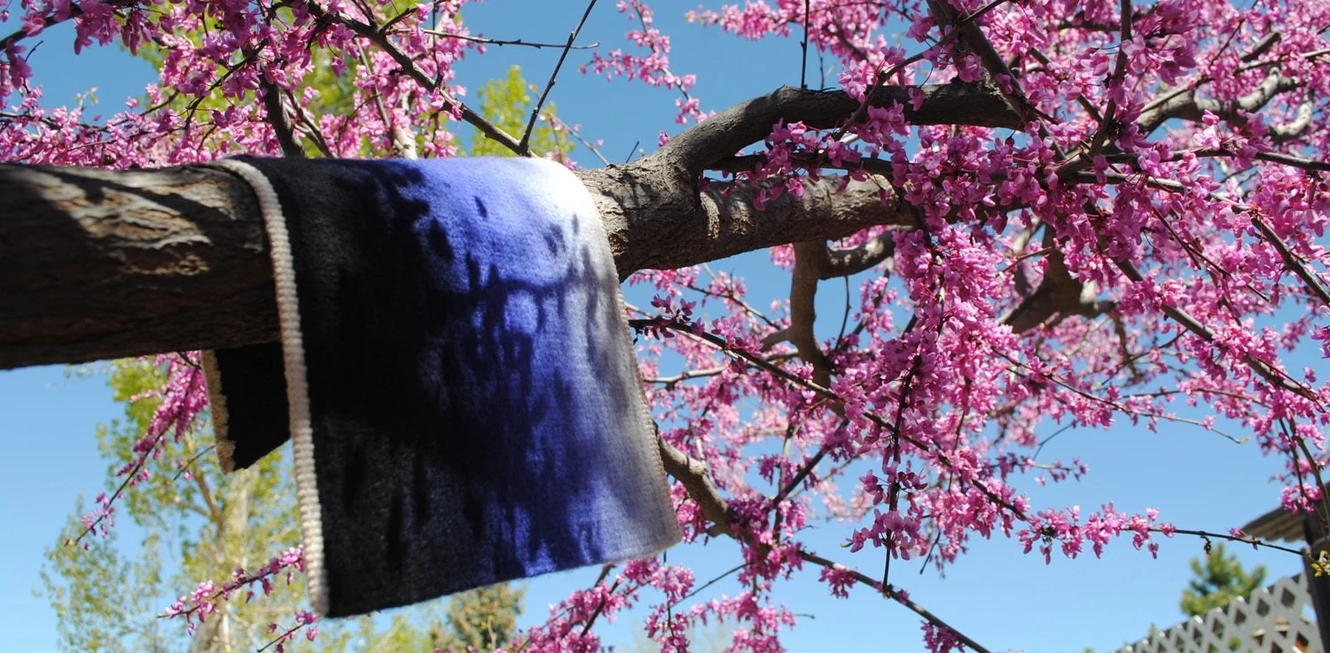
I love yarn in a fairly fierce way. I think some of that attraction to this material has to do with the deep nature of color expressed in yarn. Wool yarn especially takes dye in a beautiful, rich way. Wool being the primary material in my tapestries means that I get to use this gratifying material in all my work.
The second season of the Design Solutions course launched this month* and the first module has information on using warm and cool contrast in design. I had a lot of fun playing with these concepts as I put the course together and one of the last things I did for the first module was weave two tiny Fringeless tapestries. One was in warm colors, one in cool colors. I just wanted to see what the same sort of design looked like when woven in warm and cool colors.


