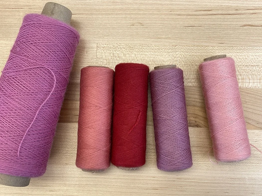
Choosing weft colors for tapestry weaving can feel a little overwhelming when you’re a newer tapestry weaver. There are many choices and they can seem overwhelming. Some tapestry yarns come in over 400 colors! How is a person supposed to choose among them when they’re all so pretty?!!
I am re-releasing the Tapestry Discovery courses so that everyone can have a chance to enjoy them. These courses were originally part of a subscription product done in collaboration with Gist Yarn and they came with a box of yarn. I made the choices, you wove with them! In the re-release, there is no yarn kit. Part of learning tapestry is figuring out how to choose colors and that is something we’re going to be doing in these courses this time around.
You can definitely order yarn from Gist and I highly recommend using Array. It is what I’m demonstrating with in the classes. This is a great opportunity to choose the colors you’d love to use for each of the classes and there is much to be learned about color by making your own choices. If you like the palette I used to demonstrate with in the course, you can use those Array hues, but don’t feel like you have to.
There are many other fantastic tapestry yarns out there and you’re welcome to use something you already have or order yarns that are more easily available to you wherever you are in the world.
How many weft colors do you need to start?
For the Tapestry Discovery courses, you need 7 colors for each class. You can have more, but most of the designs use all 7 colors so you’ll want that many. I highly recommend registering for the class before deciding on the yarn! I have suggested projects in the class and if you don’t know what those are when you’re ordering yarn, you may have to order more when you see the projects (oh no! More yarn!).
The colors you choose will depend a lot on what weft yarn you’re using. Some yarns have a lot more color choices than others, but you should be able to find a useful palette in even the smallest of yarn lines if you pay attention to hue and value. If you’re choosing a weft yarn that needs to be bundled, you’ll have more color options than if you choose yarn where you use just one strand alone. Examples of yarns that need to be bundled or that are thin enough that you have to put multiple strands together are Gist Array, Appleton crewel, Australian Tapestry Workshop yarn, weaversbazaar fine or medium, and quite a few others. Examples of yarns that work well with one strand at 8 epi are Harrisville Highland and Quebecoise.
Please note that for four of the Tapestry Discovery courses, you need to be using a thinner yarn that can be bundled. These classes are: Weft Bundling (the first one!), Color Gradation (the second one), Color Harmony, and Complementary Contrast courses.
What do hue and value have to do with choosing weft colors?
Hue and value are very important concepts. We’ll talk about this more in all of my online classes and I’m happy to help you with choices in those courses including the Tapestry Discovery courses.
Hue is simply a word for color. Blue, red, and violet are all hues.
Value is how we talk about how light or dark a hue is. Value is the relative lightness or darkness of a hue when compared to a grayscale from white to black.
When choosing weft colors, we need to consider both hue and value.
Making your first weft color choices: A general procedure
(I have further tips for the Tapestry Discovery courses further down in the post.)
I am going to walk you through choosing a palette for any of my online courses using Gist Yarn’s Array tapestry weft. You can apply this procedure to any commercial yarn or even yarn you’re dyeing yourself. Over time you’ll add to your available colors. The palettes you can create are endless, so try not to get too caught up in decisions over your first yarn purchases. You can always get other colors later and you’ll use what you do get somewhere down the road if it isn’t quite right at the moment!
Indigo 2 in Array from Gist Yarn
I recommend starting with a favorite color. I love blue-violet, so my first choice is a medium-value blue-violet: Indigo 2.*
From there I like to add some similar hues. Analogous hues are colors that are next to each other on the color wheel. Blue-violet is between blue and violet on the color wheel, so I’m going to choose one of each of those colors as well as a red-violet. This gives me four analogous colors from red-violet through blue on one side of the color wheel.
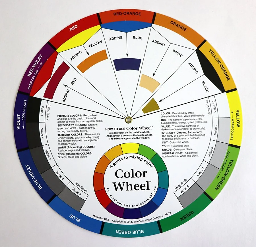
One of the color wheels I use. It is here for you to reference as you read this post.
Let’s start with Sapphire for the blue, Violet for the violet, and Walnut for the red-violet. Some of you might question that Walnut choice and call it brown. Browns are almost always a variation of red or orange and this particular hue has a lot of violet in it so I classify it as a red-violet. I could have chosen Lotus for a brighter red-violet. But I like having a form of brown in my palette and Walnut is a particularly beautiful one that fits into my scheme here.
What values should I choose of these colors? See the section below about value, but you’re going to want a variety of them, both light, dark, and a few mediums.
I started with Indigo 2.
Let’s add Sapphire 5 for a very light blue.
Violet is a very dark color and could be used as an accent or in place of a black, so I’m going with the darkest Violet, Violet 1.
And for the Walnut, let’s choose a medium value. Walnut 3.
Sapphire 5 in Array from Gist Yarn
Violet 1 in Array from Gist Yarn
Walnut 3 in Array from Gist Yarn
I have now chosen four colors. I want to add a second value of one of these colors. Since the Sapphire 5 is so light, let’s add a medium yarn in that hue so that we can practice blending colors that are similar but not the same. I’m going to add Sapphire 3.
Sapphire 3 in Array from Gist Yarn
So far that gives us 5 colors:
First five analogous colors in Gist Array
Indigo 2
Sapphire 5 and 3
Violet 1
Walnut 3
Now let’s add some complementary colors. Complements are colors that are across the color wheel and when used next to each other, they tend to make each other look more intense. I’d like to add the complement of blue-violet which is yellow-orange. Marigold is a beautiful yellow-orange and let’s take that color in it’s darkest form.
Let’s add the colors on each side of yellow-orange as well. Array’s pure yellow is called Daffodil and I’d like to include this at a lighter value, Daffodil 3. And lastly let’s add an orange which is the complement of blue. We could use a bright orange, Tangerine or we could go with a more toned down orange, Terracotta. For this palette I think I’ll try Terracotta and will choose a fairly dark level, Terracotta 2.
Marigold 1 in Array from Gist Yarn
Daffodil 3 in Array from Gist Yarn
Terracotta 2 in Array from Gist Yarn
Terracotta 1 in Array from Gist Yarn
As I was putting the yarns together and looking at the value, I realized that Terracotta 2 is actually not all that dark. I liked Terracotta 1 better and switched those two colors out.
That makes our final complementary three colors Teracotta 1, Marigold 1, and Daffodil 3 as pictured.
The complements on the yellow-orange side of the color wheel
That makes our final list of 8 colors:
Indigo 2
Sapphire 5 and 3
Violet 1
Walnut 3
Marigold 1
Daffodil 3
Terracotta 1
And here is the whole palette. This palette meets the need of having a variety of hues and values as well as creating a palette that will be interesting to work with. As you’re learning tapestry techniques, it is important to use colors that you can see the difference between. If all your hues are similar especially in value, it is going to be difficult to learn the techniques because it is harder to see what is happening when the yarns are close in value. Darker yarns are also more difficult to see when you’re practicing techniques like joins. As you practice, putting hues of varying values next to each other is the best way to be able to see what you’re doing.
Array choices of tapestry yarn
Further considerations for the Tapestry Discovery courses
For these courses, I’m teaching a technique and offering some projects to practice that technique. You can use any colors you’d like for the projects, but it will be useful if you wait to purchase yarn (or make choices from your stash) until you are in the course and can see what the projects are.
Some of the courses require particular yarns to work on the technique being presented. For example, in the first course, weft bundling, we want to have a few choices of yarns that are close in value so that they can blend in the weft bundle. And the projects presented in that class are all about doors and windows. You may want some specific colors for your architectural weaving. That class also requires that you have a weft bundle, so the yarn you’re using has to be thin enough to use at least two strands together at 8 epi (or whatever sett you’re going to use).
If you have questions about choosing yarns for these Tapestry Discovery classes, please join the class and ask there! Other people will have the same questions and we can all learn from each other.
A quick tip to help you see value
We can’t forget to include value when choosing weft yarns. Value is the relative lightness or darkness of a hue when compared to a grayscale from white to black. All that really means is how light or dark is that yarn you’re looking at? Is it an almost-black violet or a super light pink. The pink is a light value, the violet is a dark color. When creating visual images, a contrast of value is quite important.
If all the weft yarns you choose are the same value, the results can be very dull. Our eyes will see the value before the hue so that green hill against the same-value blue sky will just mush together. If you’d like more information about this, see the resources below or visit THIS blog post from 2020 where I was making some less than perfect value choices in a weaving I was doing on Change the Shed. There is a video clip of that episode included.
If you’re having difficulty seeing how light or dark a hue is, you can use a photo to help you. This works great on a smartphone. Open the camera app and find the filters. Go to the black and white filter that is called Mono (or use whatever filter you have) and put the phone over the yarn you’re looking at. The color is stripped out of the image and you can see how light or dark the hues are. There are aspects of a hue that can fool you using this method, but in general, it is a great way to gauge the value of the yarns you’re looking at especially when you’re designing a piece and have the yarn in front of you. If you don’t have a smartphone with camera filters, you can take a photo with any device and use an online app to turn it to black and white.
If you’re ordering yarn, the gradations of Array and how they’re labeled can be very helpful in knowing the value. The higher numbers (4, 5, 6) are lighter than the lower numbers (1 and 2).
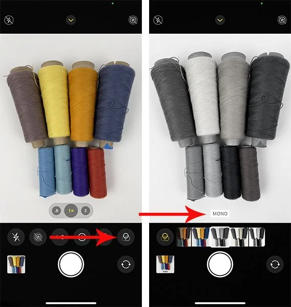
Using a cell phone camera to look at value
Here are the yarns I chose in color and in black and white.
The palette in color
The same palette in black and white
Notice that the yellow and lightest blue are the lightest values and the indigo and the violet are the darkest value. We have a nice range of value here as well as a good variety of hues.
You may decide on a palette that is vastly different than mine. That is just fine! We all have different color tastes. As long as you have some variety in the value, you will have a good start!
How much yarn do I need?
If you’re taking one of my shorter classes or weaving mostly on small looms as we are in the Tapestry Discovery courses, you can purchase smaller amounts of yarn. Gist’s Array comes in 1 ounce tubes or 4 ounce cones. The tubes are fine for small projects. Other yarns come in various put-ups though a frequently one is 4 ounces in cones or skeins.
If you’re purchasing the yarn for my Warp and Weft online class, I recommend getting the 4 ounce cones. We weave a lot in that class and the 1 ounce tubes will not go very far unless you’re using a lot of different colors. Generally 4 ounces of weft yarn will cover one square foot of weaving and often people weave 2-3 square feet in that class. More about this HERE.
For the Tapestry Discovery courses, 7 colors is a good number and for any yarn you’re going to use for a background or in greater amount, you’ll want an ounce of it. For accent colors, you may not need as much (this mostly applies if you’re using an embroidery yarn like Appletons crewel that comes in tiny 12 yard hanks in it’s smallest put-up).
Ready to weave?
What surprising choices have you made when choosing yarns for tapestry? Sometimes we think something won’t work at all and it is absolutely perfect when blended with something else. Tell us in the comments!
The Indigo colors of Array from Gist Yarn
*Gist’s Array tapestry yarn is dyed in gradations. This means that the hue name is followed by a number from 1 to 6. Indigo 2 indicates that the hue is Indigo and #2 is the second darkest color in that gradation. It is second from the left in the photo here.